Google Launches Material 3 Expressive With Fresh Dynamic Color Themes for Android
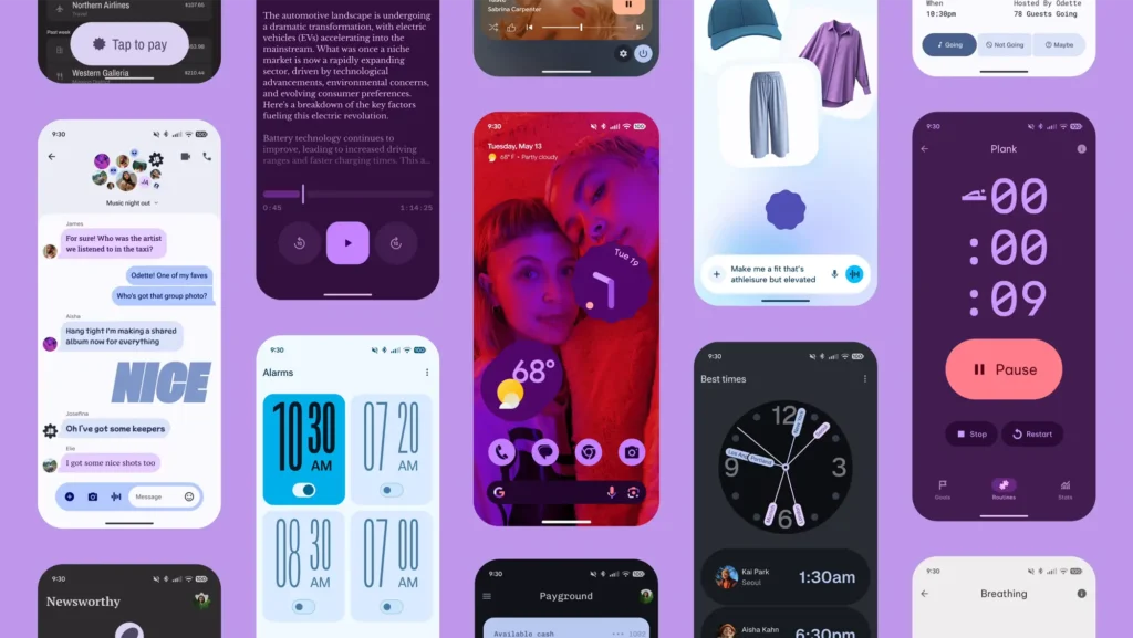
Google has officially introduced Material 3 Expressive, the latest evolution of its Android design system. This new version enhances both visual appeal and usability, offering a more personal and refined interface across Android devices. With updated dynamic color themes, improved contrast, and wider customization options, it aims to deliver a design experience that feels uniquely yours.

The Next Step in Android Design
Material 3 Expressive builds on the foundation of Material You, the design language introduced with Android 12. While Material You emphasized personalization by adapting UI colors to match your wallpaper, the new update takes it further. It introduces richer dynamic themes, bolder palettes, and improved visual harmony throughout the system.
Google says Material 3 Expressive was designed to achieve a “modern aesthetic” while prioritizing functionality. This means Android won’t just look better — it’ll also be easier to navigate, especially across different devices and screen sizes.
What’s Different About the New Dynamic Color?
The highlight of Material 3 Expressive is its enhanced dynamic color system. This feature automatically adjusts system and app colors to align with your wallpaper or theme preferences. What’s new now is the greater variety in color expressions, offering users more freedom to match their phone’s look to their personal taste.
You can now choose from multiple expressive color styles:
- Vibrant: Lively, energetic shades for a bold look
- Tonal Spot: Balanced but with added pop
- Expressive: Creative combinations with strong visual impact
- Neutral: Subtle, minimal tones for a clean interface
These themes bring more personality to your device and ensure a consistent visual experience across apps.
Better Visual Clarity and Accessibility
Another major upgrade is in the area of accessibility. Material 3 Expressive introduces enhanced contrast modes, making content more readable for users with vision difficulties. The new themes are carefully designed to ensure better legibility without sacrificing visual appeal.
This update supports high-contrast color variants, offering more visibility in bright light or for users with low vision. Google’s attention to these details reflects a growing focus on inclusivity and user comfort.
A Boon for App Developers
For app developers, Material 3 Expressive offers a more versatile and creative toolkit. With updated design components, color schemes, typography, and motion elements, developers now have more options to create visually consistent apps that still stand out.
Integration is easier too. Google has updated design tools in Jetpack Compose and Android Studio, making it simpler for developers to adopt the new design language. Whether building a social media app, e-commerce platform, or fitness tracker, developers can now create interfaces that look polished and feel native across different devices.
Consistency Across All Screens
One of the key goals of this update is design consistency. Android’s flexibility is a strength, but it can sometimes lead to visual fragmentation between apps. Material 3 Expressive addresses this by encouraging a more uniform design language across smartphones, tablets, foldables, and even smartwatches.
Apps following these guidelines will scale better on different screen sizes, offering smoother transitions and layouts whether you’re on a Pixel phone, a Galaxy foldable, or a Wear OS device.
Emotion Through Interface
Google is also leaning into the emotional impact of design. With Material 3 Expressive, there’s a clear effort to make the interface feel more human and responsive. Thoughtful animations, layered shadows, and personalized color transitions help create an experience that feels dynamic rather than static.
By allowing users to express themselves more freely through design, Google is making technology feel a little more personal — and a little less mechanical.
When Will You See the Change?
Material 3 Expressive is already making its way into Google’s ecosystem. Apps like Gmail, Calendar, and Messages are beginning to adopt the new themes. Over the next few months, more third-party apps are expected to follow as developers update their UI frameworks.
If you’re using a phone with Android 14 or later, you’ll see the most comprehensive version of Material 3 Expressive. Some features may also become available for devices running Android 12 or 13, depending on manufacturer support and app updates.
Why It Matters
Design might seem like just a visual element, but it plays a crucial role in how we interact with our devices. With Material 3 Expressive, Google is refining the Android experience to feel more unified, more accessible, and more in tune with individual preferences.
This isn’t just about fresh colors or pretty animations — it’s about making Android feel like it belongs to you. From sharper contrast and better readability to creative expression through dynamic themes, the update represents a thoughtful balance of aesthetics and functionality.
In Conclusion
Google’s introduction of Material 3 Expressive marks a significant step forward in Android’s design evolution. It enhances personalization, simplifies development, and improves accessibility — all while maintaining a sleek, modern look. Whether you’re an everyday user or an app creator, this update brings meaningful improvements to how Android feels and functions.
As Material 3 Expressive rolls out across apps and devices, expect your Android experience to become not only more colorful but also more cohesive, expressive, and user-friendly.


